
Blog

Eight Associates Promoted to Vice President at First United Bank & Trust
First United Bank & Trust is proud to announce that eight associates have been promoted to Vice President, recognizing their exceptional leadership, dedication, and contributions to the organization’s continued growth.
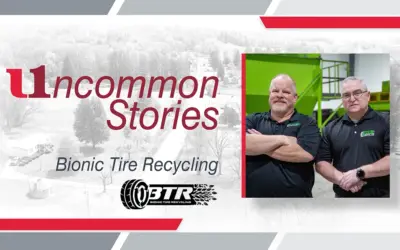
Uncommon Stories: Bionic Tire Recycling
Our first entry in our fifth season features Bionic Tire Recycling in Masontown, West Virginia. In this episode, we’re spotlighting Bionic Tire Recycling, a business making a big impact through sustainability. Every year, millions of tires are discarded, creating a serious environmental challenge.

How to Spot a Deepfake Before It Tricks You
Deepfake scams are rising fast. Criminals are using AI‑altered images, videos, and audio to impersonate loved ones, celebrities, and even law enforcement, making it harder to tell what’s real.

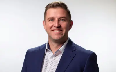
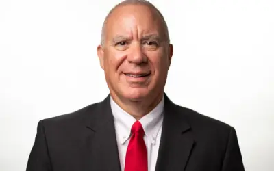
First United Welcomes Owen Elliott as Commercial Relationship Manager
Jarrod Furgason, Vice President and Director of Commercial Services – East at First United Bank & Trust, is pleased to announce the addition of Owen Elliott as Commercial Relationship Manager, serving Washington and Frederick counties in Maryland and the Eastern Panhandle of West Virginia.

First United Welcomes Maggie Robey as Vice President and Commercial Relationship Manager
Josh Bosley, Vice President and Managing Director of Commercial Services at First United Bank & Trust, is pleased to welcome Maggie Robey as Vice President and Commercial Relationship Manager, based at the Oakland, MD, Community Office.
Watch out for Government Imposter Scams
A fast-growing scam is making its way across the country, and it’s costing Americans big. Fraudsters are now pretending to be government officials or law enforcement officers, and the results are alarming.
First United Announces Promotion of Jarrod Furgason to Director of Commercial Services
Alan Mullendore, Managing Director of Commercial Services at First United Bank & Trust, is proud to announce the promotion of Jarrod Furgason to Director of Commercial Services – East, based at the Edgewood Drive Community Office in Hagerstown, MD.
Fraud Alert: Impersonation Check Scam Targeting Business Customers
A new wave of fraud is targeting business customers, with scammers impersonating bank fraud personnel in an attempt to gain access to online accounts. These bad actors are contacting businesses and falsely claiming to be from the bank’s Fraud Department, often introducing themselves as “Josh.”
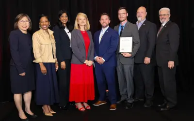
First United Receives Maryland Community Investment Venture Fund Award
First United Bank & Trust has been recognized as an inaugural award recipient of the Maryland Community Investment Venture (MCIV) Fund, a new initiative designed to expand access to capital and financial services across the state. The award was announced at the Expanding Horizons: The Access to Capital Forum held at the University of Maryland.

Protecting Older Adults from Financial Exploitation
May is Older Americans Month, a time to celebrate the contributions of older adults and an important opportunity to recognize the increased risks they face from financial fraud and exploitation.

First United Welcomes Cristina Bolyard as Community Office Manager at WestRidge Office
Carmen Pennington, Regional Retail Manager at First United Bank & Trust, is pleased to announce the addition of Cristina Bolyard as the Community Office Manager for the WestRidge Community Office in Westover, WV.

Bulls & Bears Second Quarter 2026
Click here to read the latest Bulls & Bears newsletter from second Quarter 2026.

AI Fraud Is Booming: What It Is, Why It’s Everywhere, and How to Outsmart It
If it feels like the scam calls, texts, and DMs never stop, you’re not imagining it. Nearly half of Americans (46%) say they get messages every day that seem like scams, and 77% say it happens at least weekly, according to a U.S. News & World Report survey.

Americans Trust Banks Most to Protect Them from Fraud, survey says
When it comes to fraud protection, Americans trust banks more than any other industry, a new survey says. The national survey from Morning Consult, conducted on behalf of the American Bankers Association, revealed that Americans trust banks by a 5-to-1 margin over the next closest option.

First United Bank & Trust’s Erica Riley earns Certified Associate in Project Management designation
First United Bank & Trust is proud to announce that Erica Riley, Project Specialist, has successfully earned her Certified Associate in Project Management (CAPM®) designation from the Project Management Institute, an internationally recognized credential demonstrating excellence in foundational project management skills.

First United welcomes Tin Ly as Mortgage Relationship Manager
Scott Hostetler, Managing Director of Mortgage Solutions at First United Bank & Trust, is pleased to announce the addition of Tin Ly as a Mortgage Relationship Manager in the Frederick, MD, area.

Why Checking Your Credit Report Matters
Whether you’re car shopping, applying for a job, looking for a home, or just getting your finances in order, your credit report plays a big role. It’s a snapshot of your financial history, including how you pay your bills, your personal accounts, and even bankruptcy filings. Lenders, employers, and landlords often review it before making decisions.

First United announces promotion of Diane Emory to Managing Director of Financial and Management Accounting
Tonya Sturm, Executive Vice President and Chief Financial Officer at First United Bank & Trust, is proud to announce the promotion of Diane Emory to Managing Director of Financial and Management Accounting, effective November 2025.

QR Code Fraud Alert: How Scammers Are Targeting You
QR codes have become a convenient way to access information, make payments, and complete tasks quickly. But as their popularity grows, so does the risk of fraud.

First United Announces Mary Kate Mumper as Deposit Relationship Manager
Alan Mullendore, Managing Director of Commercial Services at First United Bank & Trust, is proud to announce the addition of Mary Kate Mumper as Deposit Relationship Manager, based at the Hagerstown Emerald Square Community Office.

Denise Greenbeck Hess Selected for 2026 ABA Emerging Leaders Scholarship
First United Bank & Trust proudly announces that Denise Greenbeck Hess, Deposit Relationship Manager, has been selected as a recipient of the 2026 ABA Emerging Leaders Scholarship.

First United Bank & Trust Announces Jason VanSickle as Managing Director of Specialized Banking
Jason Rush, President and CEO of First United Bank & Trust, is pleased to announce the appointment of Jason VanSickle as Managing Director of Specialized Banking.

Kimberly Hayes joins First United as Regional Retail Manager
Amy Garner, Managing Director of Retail at First United Bank & Trust, is proud to welcome Kimberly Hayes as Regional Retail Manager, based at the Edwin Miller Community Office.
First United welcomes Jarrod Furgason as Commercial Relationship Manager
Alan Mullendore, Managing Director of Commercial Services at First United Bank & Trust, is proud to announce the addition of Jarrod Furgason as Commercial Relationship Manager, based at the Edwin Miller Community Office.

Michael Renzi Promoted
Michael Renzi named Assistant Branch Manager in First United Sabraton Office Brandy Fawley, Community Office Manager at First United Bank & Trust, is pleased to share that Michael Renzi has been named Assistant Branch Manager of the Morgantown Sabraton Office. In...
First United Bank & Trust proudly announces AJ Tasker as Senior Vice President and Chief Operating Officer
Jason Rush, President and Chief Executive Officer of First United Bank & Trust, is pleased to announce the appointment of A.J. Tasker as Senior Vice President and Chief Operating Officer.

Love Is in the Air, But So Are Romance Scams
Romance scams are on the rise, and they can happen to anyone. These scams often start on dating apps, social media, or even through unexpected messages. The goal? To build trust and then exploit it.
Our Cookie Preferences have Updated
To give you more control over your data and create a more transparent browsing experience, we are introducing a new cookie consent pop‑up on our website.

Identity Theft Awareness Week: Steps to Protect Yourself
Identity Theft Awareness Week runs January 26-30, 2026, and it’s the perfect time to make safeguarding your identity part of your everyday routine, just like brushing your teeth or taking out the trash.

First United Bank & Trust announces Kirsten Deering as Engagement Manager
Denise Phelps, Director of Leadership and Engagement at First United Bank & Trust, is proud to announce the appointment of Kirsten Deering as Engagement Manager.
Bulls & Bears First Quarter 2026
Click here to read the latest Bulls & Bears newsletter from first Quarter 2026.
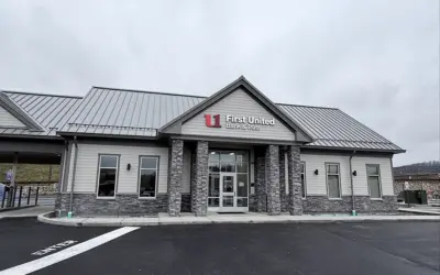
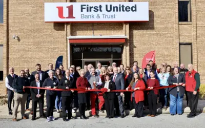
First United Bank & Trust Celebrates Grand Opening of new WestRidge Community Office with Week-Long Event
First United Bank & Trust is proud to announce the grand opening of its newest Community Office at 46 Red Dog Way, Westover, WV 26501. To celebrate, the bank is hosting a week-long celebration from Monday, January 26, through Friday, January 30, featuring daily giveaways, local treats, refreshments, and opportunities for the community to meet the WestRidge team.

First United’s Phil Rodeheaver and Cassandra Bradshaw receive CRCM designations
First United Bank & Trust is proud to announce that Phil Rodeheaver and Cassandra Bradshaw recently earned their Certified Regulatory Compliance Manager (CRCM) designations.
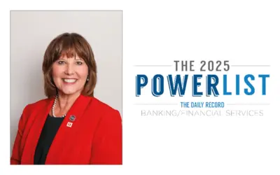
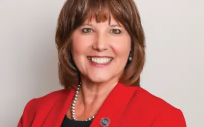
Carissa Rodeheaver Recognized on The Daily Record’s 2025 Banking & Financial Services Power List
First United Bank & Trust is proud to celebrate Carissa L. Rodeheaver on her recognition in The Daily Record’s Banking and Financial Services Power List, honoring leaders who help drive Maryland’s economic growth.

Watch Out for Bank Imposter Scams: What You Need to Know
Have you ever received a text that looks like it’s from your bank? It might say there’s suspicious activity on your account and urge you to act fast. Before you click or respond — pause. It could be a scam.
Boonsboro Ribbon Cutting Event
First United Bank & Trust Celebrates 125th Anniversary with Ribbon Cutting at New Boonsboro Location BOONSBORO, MD. — December 18, 2025 — First United Bank & Trust marked its 125th anniversary with a ribbon-cutting ceremony at its new Boonsboro office,...

Financial Fraud Is on the Rise. Are You at Risk?
More than 1 in 5 U.S. adults have experienced financial fraud or scams involving their money, according to a new survey from the Federal Reserve. The findings come from the Fed’s 2024 report on the Economic Well-Being of U.S. Households, which, for the first time, asked Americans about their experiences with fraud and scams.
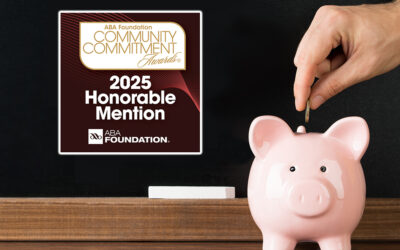
First United Bank & Trust Earns Honorable Mention in ABA Foundation’s Community Commitment Awards
First United Bank & Trust has been awarded an Honorable Mention in the American Bankers Association (ABA) Foundation’s Community Commitment Awards, earning finalist status in two categories: Financial Education and Supporting Military Families for its innovative My Finture® Financial Education Center.

First United Bank & Trust Celebrates Ribbon-Cutting at new WestRidge Location
First United Bank & Trust is excited to announce the official ribbon-cutting for its new WestRidge office at 11 a.m. Wednesday, Dec. 17. This modern office, conveniently located at 46 Red Dog Way, Westover, WV 26501, marks a significant milestone as the bank continues to grow alongside the vibrant Morgantown community.

Giving Safely: Avoiding Charity Scams During the Holidays
The holiday season is a time of generosity, reflection, and giving back. But unfortunately, it’s also a prime time for scammers to take advantage of your goodwill. With so many donation requests flooding inboxes, social media feeds, and even text messages, it’s more important than ever to give wisely and protect yourself from charity scams.

December Is Identity Theft Protection Awareness Month. Here’s How to Stay Safe
Identity theft can happen to anyone, and during the holiday season, scammers are especially active. December is Identity Theft Protection Awareness Month, and at First United Bank & Trust, we’re committed to helping our community stay informed and protected.

That USPS Text could be a Scam
Getting a text about a package delivery might seem routine. But if that message includes a link and claims to be from USPS, FedEx, or DHL, there’s a good chance it’s a scam.

Gift Card Scams: What You Need to Know
If someone contacts you by phone, text, email, or social media and tells you the only way to fix a problem is by buying gift cards and sharing the numbers, it’s almost certainly a scam.

First United’s Turf Field Gift Propels Garrett College Athletics Forward
First United Bank & Trust is making a lasting impact on Garrett College athletics. Its recent turf field naming gift pushed the Athletics Capital Campaign past its critical $500,000 goal.
Press Release
First United Corporation Announces Planned Retirement of Chairman of the Board, President & CEO Carissa L. Rodeheaver Oakland, MD — November 14, 2025 — First United Corporation (NASDAQ: FUNC) and First United Bank & Trust today announced that Carissa L....

First United’s A.J. Savopoulos receives globally recognized CISSP designation
First United Bank & Trust is proud to recognize A.J. Savopoulos, Director of IT, for earning his Certified Information Systems Security Professional (CISSP) designation.

First United Celebrates Amy Garner’s Graduation from MBA Emerging Leaders Champion Program
First United Bank & Trust is proud to announce that Amy Garner, Managing Director of Retail, recently graduated from the Maryland Banking Association’s Emerging Leaders Champion Program. This prestigious achievement marks a significant milestone in Garner’s professional journey and reflects her unwavering commitment to leadership excellence.

First United Welcomes Kegan Murphy as Wealth Advisor Associate
First United Bank & Trust is proud to welcome Kegan Murphy as a Wealth Advisor Associate in the Hagerstown, MD, area, announced Shane Small, Vice President and Senior Wealth Advisor.

Grand Opening of New Boonsboro Community Office
First United Bank & Trust Celebrates Grand Opening of New Boonsboro Community Office BOONSBORO, MD — First United Bank & Trust is proud to announce the grand opening of its newest community office located at 207 N. Main Street, Boonsboro, MD. To celebrate this...
Thomas Begley Joins First United as Senior Wealth Advisor – Team Lead
First United Bank & Trust proudly announces the appointment of Thomas Begley, CFP® as Senior Wealth Advisor – Team Lead, serving clients in the Morgantown area. The announcement was made by Chief Wealth Officer Keith Sanders.